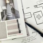
Earlier in the year I spent some time working with a family who needed help with the space planning in their home – the layout just wasn’t working, which meant they had a number of completely unused spaces. After great discussions, and having gained a good understanding of their needs as a family, we reconfigured the layout and uses of the rooms to give them a space that delivered practically for the whole family.
Now the space planning is complete, we’re able to get started on the next stage, looking at the design of the rooms. We’re starting with one of the reception rooms, which will primarily be used by the two boys to watch TV, play games and hang out with their friends as they grow older. The room should have a warm and cosy feel, and be suited to the young boy, but not decorated in a childish way, as we wanted to keep the flexibility of the use of the room going forward.
Using bright, but earthy tones, paired with natural materials such a wool, leather, wood and wicker, the design is striking the right balance between a young and adult space, and has a really cosy and comfortable feel to it. We’ve added in hints of fun, such as the sheep cushion and brightly coloured checked blanket to help keep the space family friendly.
In contrast, we’ve been working this week on another teenage girl’s bedroom. She’d chosen the Farrow & Ball’s Middleton Pink for her wall colours, but stuck on what to do for the rest of the room.
To give this quite traditional pink a young and contemporary twist, we’re going to be adding in flashes of fuchsia pink, white and gold in the soft furnishings and other accessories. This is a really feminine look, but without looking too fussy, and I think would suit a young teenager, right through to a girl in her twenties (or thirties!)
In any design, adding in the final touches to dress the space makes all the difference, so adding in the framed prints (as pictured above) will be really important in pulling the design together.
Wishing you all a great weekend,
Claire.

